Setting up your online travel agency requires many steps. Setting up an adequate infrastructure, finding the best products on the market or taking into account the laws of electronic commerce: all these are quite bureaucratic steps that need to be achieved.
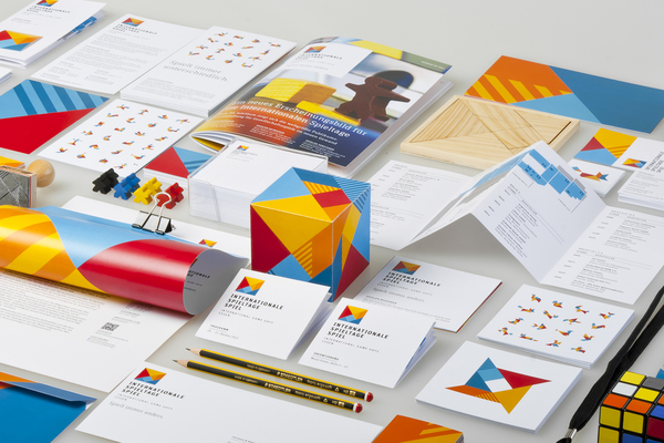
But things begin to come to life when the time comes to think of something as relevant as the corporate image for travel agencies that suits you. This is a fundamental aspect when launching your business. The brand builds confidence and will help us position ourselves in the market and differentiate ourselves from the competition.
It is important to note that our company is behind our brand. Remember that of multiple occasions, the first impression is the one that counts and our brand can be our best business card. Our customers only need a few seconds to have an opinion about our brand. And based on that they will decide if they want to know more about our travel agency or not.
Furthermore, consider that the brand of your travel agency will be imbued with a series of values. Your brand has value. And this is a feature as intangible as imperishable.
With all this information, don’t you think you must devote sufficient time to your corporate image?
Corporate image for online travel agencies: the elements
A good corporate image is made up of various elements, such as the logo, your website, your company’s blog, the content and management of your social networks … among many other things. But above all, we must bear in mind that all these elements are consistent and follow the same “editorial line”. It is no use to have designed the most professional business card in the world if at the same time your website is unavailable or is not adapted to all devices. The expectations of any client will be automatically disappointed.
The logo in online travel agencies
The logo of your online travel agency will occupy a prominent place in the firmament of your corporate image. It is one of the most direct channels to communicate the right message you want to reach your potential customers. Therefore, when designing it you must take into account some factors:
- Easy to read and scalable to any size.
- Avoid overly complicated or convoluted forms because this will hinder its reproduction on any surface.
- Try to be memorable, that is, easy to remember.
- Pay special attention to corporate colours.
This last point is especially important because depending on the target audience of your online travel agency, it may be helpful for you to use various colours in your logo. This is known as “colour psychology” and this is what the colours most commonly used in corporate images inspire:
- White: cleanliness and purity. It transmits peace and tranquillity
- Black: seriousness, stability and elegance.
- Red: the colour used par excellence to attract attention. Love, passion, energy, aggressiveness.
- Blue: security, dignity, serenity.
- Green: it is associated with both health and money. But it also connotes freshness, freedom and tranquillity
- Yellow: it is the colour of energy, strength, warmth and happiness
- Orange: suggests youth, good mood and ambition
Tips for designing your online travel agency’s logo
If with all the information you have read so far, you are still not sure how to design your logo, take note of these last three tips:
- Go for a logo that is friendly and visually attractive. Think of the audience you are addressing and the business values you want to convey to them.
- It is important that it is easy to read, pronounce and remember.
- Do not imitate your competition. Differentiate yourself from it as much as you can.
- Do not hesitate, pick a good corporate image for your online travel agency.


